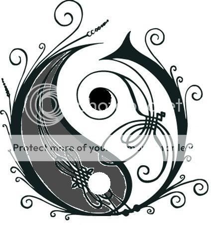
Opeth logo: Yin and Yang

Tepheron

Member
Apr 27, 2008
84
0
6
Has anyone else noticed that the Opeth logo is similar to the Yin and Yang symbol? I noticed it lying on my side, looking at the Opeth logo on my Desktop.

I wonder if that was the original intention; Yin and Yang -> black and white -> contrast? I feel Opeth has more contrast than any other band I've heard.
 
well if you look at the "bowtie" looking thing in the lower-left quadrant of the O, it symbolizes a dragonfly flying northeast. if you examine it closely, the large shape in front of it is a large bird (probably an albatross), flying away from the dragonfly, almost like it's being chased. this symbolizes the concept of the smaller conquering the larger, which is a consistent theme in opeth's lyrics (i.e. godhead's lament, karma, nectar, etc...) but the whole "O" actually surrounds both of them, representing the fact that as far as they fly, they will never escape the simple frame of their small reality. this concept is very nietschean and crops up in a few songs as well, most obviously "by the pain i see in others".

and of course, i've saved the most obvious theme for last - what is the most prominent symbol throughout the whole logo? spirals! the theme of spiraling down is a HUGE thread in the band's music and lyrics. even in the cover art! for example, spirals appear in the smoke on the cover of ghost reveries. the logo is a huge network of symbolism and is really important to a proper understanding of opeth's music.

:lol:


Anyway, I doubt it has any meaning (apart from being the initial of Opeth)
 
Also;

Also noticeable is the thicker line that looks to kind of be a part of the "O" that is kind of curving down the middle splitting the dragonfly with the albatross. It seems to turn the "O" into a yin-yang symbol. This symbol is the epitome of Taoist belief/philosophy and represents the importance of balance in life and nature.

Everything in reality has some sort of opposite to it, it is actually the fact that things have opposites that allow us to define and understand them. Would "hot" have any kind of meaning to us without the existence of "cold"? Of course not, and this fact shows us that both sides of the spectrum are needed in life and must be equally balanced. For example, since "good" cannot have meaning (or rather exist) without "evil", then it is not a good thing for "evil" to be wiped away. Even so, they must be equal in balance; however, there are so many things in the world of our existence that are of unequal balance, in which need to be rebalanced. It seems that the one who brought up earlier the dragonfly and albatross representing the smaller and larger respectively is definately on to something.

As you may notice, this yin-yang symbol is a little bit altered, or rather "unbalanced". The side of the albatross is too big; however, the side of the dragonfly is making pursuit in an attempt to make the balance equal again. You could probably correlate the duality of the smaller and larger with anything in life and nature, rich/poor, powerful/weak, peace/war, the list could go forever. The main idea here is that these two sides also generally represent qualities of masculinity and femininity, with the state of the world right now being in control by these masculine qualities. There is no balance in this world we live in currently, and since the dragonfly "naturally" flies northeast, it could as well show meaning in that balance is a part of our "natural" world.

It's funny how I had never really looked closely at the "O" symbol of Opeth, and now that I have seen an up close picture in a thread about symbolism I could point out all of this. For all we know maybe Mikael didn't even mean for it to have any type of meaning at all, and one day he sees this thread and is like "wow, I just came up with a neato lookin' symbol and accidentally stumbled upon all this!". Although, knowing Mikael, and thinking about the types of ideas throughout Opeth's music, I would highly doubt the symbolism is a mere coincidence.
 
Yeah and I think they're probably right, their arguments are very logic and coherent with Opeth's music.
 
Opeth-logo-dark1.jpg

Opeth – Absolute Metal Harmonization
.
 
Seriously.. stop trying to go in such details. Making a band is not like "Da Vince Code". There are not things hiding with strange and personnal significations in every points. It's just a logo (made by an artist, not even the band) and it looks nice. I've heard some [insane] fans of whatever-band said they thought some tabs of that band were based on mathematic formulas. That it pretty ridiculous don't you think?
 
Seriously.. stop trying to go in such details. Making a band is not like "Da Vince Code". There are not things hiding with strange and personnal significations in every points. It's just a logo (made by an artist, not even the band) and it looks nice. I've heard some [insane] fans of whatever-band said they thought some tabs of that band were based on mathematic formulas. That it pretty ridiculous don't you think?

Haha, that's what happens when a band becomes famous :rofl:
 
Seriously.. stop trying to go in such details. Making a band is not like "Da Vince Code". There are not things hiding with strange and personnal significations in every points. It's just a logo (made by an artist, not even the band) and it looks nice. I've heard some [insane] fans of whatever-band said they thought some tabs of that band were based on mathematic formulas. That it pretty ridiculous don't you think?

it's Tool all over again. :(
 
Seriously.. stop trying to go in such details. Making a band is not like "Da Vince Code". There are not things hiding with strange and personnal significations in every points. It's just a logo (made by an artist, not even the band) and it looks nice. I've heard some [insane] fans of whatever-band said they thought some tabs of that band were based on mathematic formulas. That it pretty ridiculous don't you think?

I hear you. Most of what's written here is just speculation and pretty far-fetched if you ask me. Even so, I have to admit that the logo and its resemblance to Yin and Yang fits pretty good with the band - deliberate or not.
 
I hear you. Most of what's written here is just speculation and pretty far-fetched if you ask me. Even so, I have to admit that the logo and its resemblance to Yin and Yang fits pretty good with the band - deliberate or not.

Just like my fingers put in a strange way... haha. Ying Yang fits pretty much everywhere, mostly in Spider Man. Sorry I'm feeling like joking.