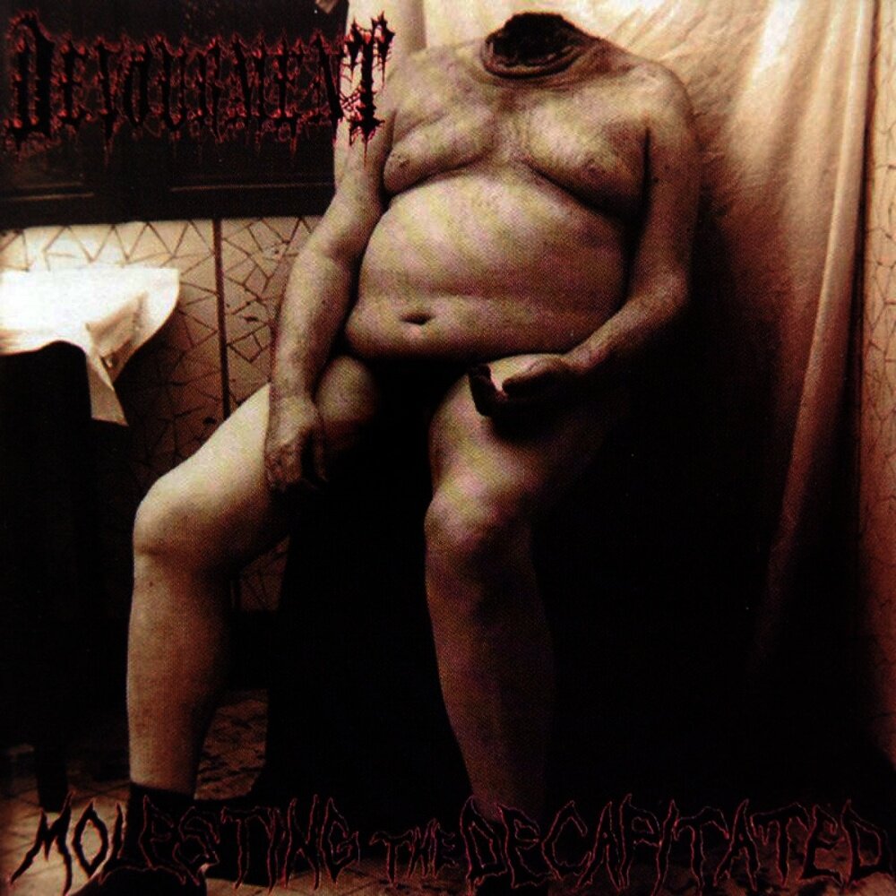
I haven't heard the whole album, just the singles they constantly play on the radio, which I like to some extent. I like the colors and the scenery, but I think the imagery and subjects are rather grotesque in an off-putting way. I don't have any objections to how it's done technically, just subjective stuff about how I think the people are weird and lame looking. Heh.
Also, the top header taking up that much of the cover...for the fail.
Hearing the radio singles in relation to the entire album really draws out its unique (I think) sound. It has this melancholy sense of reality, but with a touch of spirituality that lifts it above the mundane. The lyrics really evoke a kind of detached spirituality, like something being written in order to escape a dreary world. And in some moments the album really soars, like "Lightning Crashes" (which everyone knows) and the finales to the songs "Iris" and "Pillar of Davidson."
If you're ever in the mood for really good post-grunge I'd recommend it. It's one of my favorite 90s albums. I truly think it's unmatched when it comes to that era.
Another I'll throw out there is Genesis's Trespass:

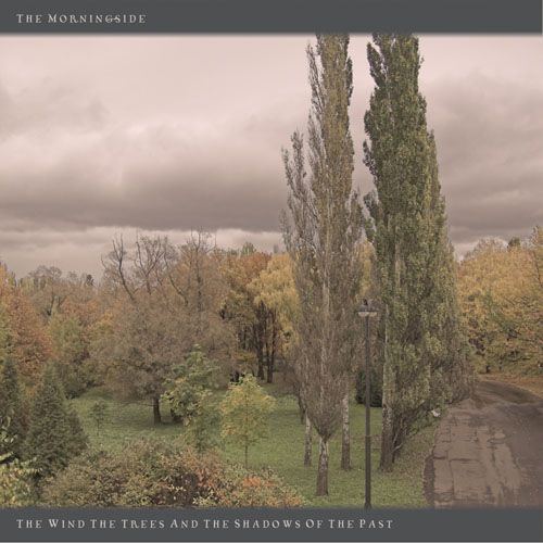
The album has a very mythological/pastoral tone, which I think is captured in the artwork.


