Oak Knoll Tshirt & banner planning

not sure it's a pun but more of a allegoric expression :)
we take our allegory seriously here hehe
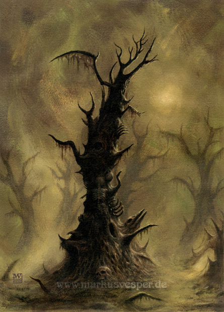
I have Tomas putting in a better skull and we are playing with the roots..
i still don't want tribal like roots behind it.. more like sharp - distinctive roots
and i'm almost tempted to take out distributor.. cuz that's the least thing i wanna be known for - i'd rather be known for the label

and the shirts.. we are adding the roots back in behind the hammer.. but need to work on the roots.. maybe we should add the hammer to this banner over the roots and behind the skull? like the shirt will be? but 30% opacity on the roots
 
Tomas? where did you disappear to? Anyhow, I made the Pit ad myself...
(1/4 page b&w Fireborn / OK ad, alot to cram into a small space)
(that's a burning tree/forest in the background)

pit_ad.jpg
 
Ya, I haven't gotten around to replying to you on this. I am not sure if I want prices and my address on there ad. For many reasons. But I'm definately up for discussing it. Some of my reasons 1) I might be moving this year 2) prices change 3) the look of an ad with prices makes it look like a catalog - you'll notice some big distro ads cram a list of cds for sale into 1 page or so. I'm aiming for more or a ad that looks like ones you see from other labels. 4) don't wanna have to get a PO box so people don't bomb my house :) 5) if I list distributors they would feel obligated to sell at the same price, which is how they make their upcharge/profit from wholesale or trades

that's just my cons about listing prices and my address.. but it's cool- maybe you can persuade me otherwise? i'm always up for listening to ideas and other people's logic. Does anyone else want in on this voting? :)
 
it's 50 euros for poster use and 150euros for tshirt
I REALLY like what Tomas did for my tshirts.. heck I LOVE the BM look
but I also like the above. Maybe I should make a BM looking shirt and a Deathy one. Or just put one on each side. What do you guys think? Maybe Tomas (angelwebzine guy) can give me some ideas. Do you other guys find one side of my shirt better than the other? Can I maybe put this deathy picture on front and a black metal style look on the back?
 
After talking to Tomas.. I think I'm making two versions of the shirt. 1) Tomas's black and doomy look 2) a deathy one with the deathtree above and on the back small logos of the bands

what do you guys think?