
HardTo Read Band Logos
- Thread starter Blackwater Demon
- Start date
You are using an out of date browser. It may not display this or other websites correctly.
You should upgrade or use an alternative browser.
You should upgrade or use an alternative browser.
Holocaust on the Moon
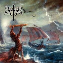
Temples of Syrinx
but...but...teh kvltness!Even more annoying than the fact that most are unreadable are the fact that they all look exactly the fucking same. It's like they're all begging the world to know that they suck just as much as the next disposable, shitty no-name extreme metal band.
Twelveby5
No Carrot For Hopefuls
get a spider drunk on some tr00-kvlt vodka, dip the spider in black, and let him roam free on a piece of paper and voila! there you go! you next uber k00l logo. idiots.
Lothlorien
Towards the Great Sky
- Jan 28, 2006
- 1,851
- 2
- 38
but...but...teh kvltness!
think ov aul teh kvltness!
in_my_time_of_disease
Whipping Post

SerenityNow!
*burp*
Twelveby5
No Carrot For Hopefuls
Twelveby5
No Carrot For Hopefuls
^ don't get it. maybe i'm just too...un-tr00...i prefer the 'exodus', 'testament', 'accept', kinda logos..... the 80s had the coolest, cheese-ridden logos ever \m/
dwoakee
Suboptimization Expert

bestial tomb, apparently
well, not really "apparent". I managed to read "bestial" without knowing before what it meant, but i wouldn't have found out the "tomb" part.
dwoakee
Suboptimization Expert
^ don't get it. maybe i'm just too...un-tr00...i prefer the 'exodus', 'testament', 'accept', kinda logos..... the 80s had the coolest, cheese-ridden logos ever m/
Those 80s logos were completely readable and mostly tried to look monumental (which makes it so cheesy). But you have to admit that they are relatively simple. While I'm absolutely no fan of black metal and I also like a readable band name those logos are definitely much more creative. I think they're aiming to be mysterious and threatening, fragile, withering, and menacing at the same time. A lot more than just monumental cheese, the BM logos are subtle, complex cheese
") . Some are actually pretty good.
. Some are actually pretty good.Lightbulb Sun
Losing the Skyline....
well, not really "apparent". I managed to read "bestial" without knowing before what it meant, but i wouldn't have found out the "tomb" part.
I believe the B is backwards if it helps.
Those 80s logos were completely readable and mostly tried to look monumental (which makes it so cheesy). But you have to admit that they are relatively simple. While I'm absolutely no fan of black metal and I also like a readable band name those logos are definitely much more creative. I think they're aiming to be mysterious and threatening, fragile, withering, and menacing at the same time. A lot more than just monumental cheese, the BM logos are subtle, complex cheese
Agree, except that I actually like bm.
The logos from the 80's mirrored the sounds of the bands perfectly: in your face, bold, decipherable. The same is true of these logos and the intents of bands they are for: hearkening to nature, chaotic, impenetrable, beauty within noise. Like much of the music, you kind of have to work a bit to find the salient features. And, the logos say, "Fuck you, we don't need you. If you don't get it, we're not for you.." Besides, the words become symbols anyhow, recognizable by the design, not by their meaning.
Don Corleone
Emre
Lothlorien
Towards the Great Sky
- Jan 28, 2006
- 1,851
- 2
- 38
Risquit
Member
Twelveby5
No Carrot For Hopefuls
^ + 1
Those were the days!
My deal is that a logo is like brand-imaging, right. i mean it's a way for the fans to bond with the band. the reason why risquit drew the maiden logo thousands of times is because the logo itself is very appealing, it supports the music. How many school benches have you seen with one of those BM logos (maybe i haven't been to a school in a while, but still)? the logo spreads the word, etc etc etc. i feel that a legible logo is (one of many) an important thing when you're in the business of producing and publishing music.
Similar threads
- Replies
- 4
- Views
- 1K
N
- Replies
- 6
- Views
- 878
S
- Replies
- 28
- Views
- 5K
S