
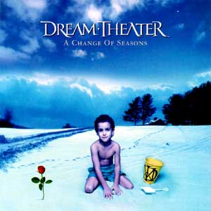
Worst album cover ever?
- Thread starter nomisofsiman
- Start date
You are using an out of date browser. It may not display this or other websites correctly.
You should upgrade or use an alternative browser.
You should upgrade or use an alternative browser.
What do you mean when you say "way off and inconsistent"? I'm not seeing it.
The shading, lighting, and overall tone of the black and reds is not consistent with the colors around it. It looks like it was copied and pasted over the layer, as opposed to blending it in.
AngraRULES
Member

And here's another awful cover art:

What is wrong with that one?
Metal has plenty of bad album covers.
And since eventually most of these will get posted, here's a list of some really bad covers.
http://www.coverbrowser.com/covers/worst-album-covers
Still my favorite of the worst.

And since eventually most of these will get posted, here's a list of some really bad covers.
http://www.coverbrowser.com/covers/worst-album-covers
Still my favorite of the worst.
AngraRULES
Member
What is wrong with that one?
I think it's awful. It's a cool idea, but very poorly executed. It's all about personal taste right?
Jasonic
Doom On!

Comic Book Dude
Rockin'
The shading, lighting, and overall tone of the black and reds is not consistent with the colors around it. It looks like it was copied and pasted over the layer, as opposed to blending it in.
The central figure isn't supposed to blend in with the surrounding art...this is to make her "pop". If her shading and coloring were done like the background art, she would be lost within it. Same with the logo/lettering.
Akumu
Look at the tree.

Jasonic
Doom On!


Osiris' Eyes
El Duderino
AngraRULES
Member
This is starting to become another lame ass "let's argue why I think this is shit by dissecting all of the aspects of this artwork..."
I swear to God, it's like a progsnob discussion on why Mike Portnoy decided to play this time signature over that, or why he chooses chocolate covered donuts every morning...
I swear to God, it's like a progsnob discussion on why Mike Portnoy decided to play this time signature over that, or why he chooses chocolate covered donuts every morning...
Comic Book Dude
Rockin'
No, THESE are epic!
I gotta agree on all of these....EXCEPT.....the Omen cover. I LOVE this album, but this cover looks like something you would find drawn on a high-school students paper binder. The other stuff you posted....very epic indeed!
Comic Book Dude
Rockin'
This is starting to become another lame ass "let's argue why I think this is shit by dissecting all of the aspects of this artwork..."
I swear to God, it's like a progsnob discussion on why Mike Portnoy decided to play this time signature over that, or why he chooses chocolate covered donuts every morning...
....and your point is?
How is this discussion any different from the multitude of other threads on this board?
AngraRULES
Member
....and your point is?
How is this discussion any different from the multitude of other threads on this board?
My point is simple: it'd be much more fun to see people post their picks over an argument about how consistent the lines are on this or that piece of art.
You don't need to get offended just because this is what you do for a living. I just think that if you get too technical, the thread will soon be abandoned. That's all.
And how is this discussion different? Hmmm... good question. Let me sketch out an answer for you...
")

dcowboys311
Member
The one I want to post is too offensive. NSBM band. It's taken from an internet meme.
I always thought the cover for Pantera's 'Metal Magic' was pretty bad.
I always thought the cover for Pantera's 'Metal Magic' was pretty bad.
Jasonic
Doom On!
The one I want to post is too offensive. NSBM band. It's taken from an internet meme.
Ha, yeah, I instantly thought of some offensive ones.
Go check out bands like WACO JESUS or DEMONIAK on Metal Archives.
Jasonic
Doom On!

Purveyor Of Evil
Heavy Metal, INC.
Im at a loss...Yes, two fake looking unattractive 80's cartoon pornstars with comically large breasts getting ready to make out is a horrible album cover.

Comic Book Dude
Rockin'
My point is simple: it'd be much more fun to see people post their picks over an argument about how consistent the lines are on this or that piece of art.
You don't need to get offended just because this is what you do for a living. I just think that if you get too technical, the thread will soon be abandoned. That's all.
And how is this discussion different? Hmmm... good question. Let me sketch out an answer for you...
No prob....I'm not offended at all....I just didn't think anything was getting that technical. Besides, if we all posted our picks, this thread would be terrifying since there are sooooo many bad covers in metal.
Similar threads
- Replies
- 46
- Views
- 4K
V
- Replies
- 0
- Views
- 350
M
- Replies
- 11
- Views
- 831
C
- Replies
- 16
- Views
- 951
N
- Replies
- 31
- Views
- 2K
N