New Meshuggah Album Koloss Artwork & Track Listing

An example:
777sects.jpg


I agree most metalcore, melodeath and deathcore bands have terrible artwork.
It just doesn't look like it's a cover for a band of Meshuggah's popularity.

yeah, i really fail to see how this is better in any way, shape or form than the artwork for koloss.
 
^ - Agreed. That one looks like it was made by a wannabe designer, just pasting stock photos around, looks like horse shit.

Look at the gradient around that fucking planet, you think that looks pro? o_O
 
I was kinda hesitant to post anything tbh, because I'm not talking about it subjectively.
Part of the appeal of art aesthetically, for me anyway, is that you don't see the technique used to create it.
A pencil drawn image shouldn't look like lines and shading, it should look like whatever is being drawn.
On this cover you can clearly see the technique (the photoshop brush), and personally I hate that.
Also, the font used for "Koloss" doesn't match the rest of the image.
 
yeah, the Koloss font doesn't match very well and I think the K looks like shit.
But I still can't judge it very well without seeing it in reality.
 
I don´t dislike the artwork, but IMO that Blut Aus Nord absolutely destroys it, how can you not like it and find it "amateur"? Oh well, you know what they say, opinions are like assholes...

The Blut Aus Nord art looks pretty good to me too, but it doesn't seem as professional to me. I feel like I could make something similar on my own with just a bit more skill in photoshop, and I'm no graphic artist... Still, I'd be satisfied with art like that for my album cover... but the Luminokaya Lab "Gateman" images for Meshuggah are just on another level. They're so detailed and creative.

Some of this guy's other stuff is great too. Reminds me of Robert Venosa and Alex Gray. I love surreal/psychedelic/visionary art.

butterfly2.jpg


sierppalace-1.jpg


Spirit-of-fusion-gold.jpg
 
I think Meshuggah should have consulted with the forum before making any album art decisions.
 
Are they they detailed or just busy though?

It is sort of busy, but I think as a band Meshuggah are pretty busy, detailed, and all over the place musically, out of the norm, so why shouldn't their album art reflect this? I am curious to see what direction they have gone in for this album. Have they posted any teasers yet?
 
man, if some of you aren't bitching about the recording quality, or the sound of the snare or guitar tone, or the music writing, it's gotta be about... something. It's just an album cover. As long as the music is good who cares. lol
 
No shit, it could be a picture of Jens sitting around watching TV for all I care... not like anybody buys CDs anymore anyways.
 
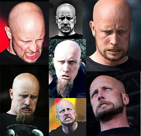
I wish Jens didn't make those dumbass faces all the time. I would be embarrassed to be in a band with someone who did that publicly. I guess it gives Meshuggah some comedic relief, but it's still embarrassing...
 
He doesnt do those faces purposely to look goofy, bro. He's just one of the most intense frontmen out there... that guys performances look tiring just to watch.