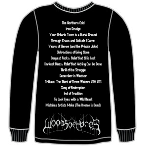
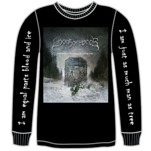
You, the (woods)people! What kind of new shirts do you want to see?
- Thread starter David Gold
- Start date
You are using an out of date browser. It may not display this or other websites correctly.
You should upgrade or use an alternative browser.
You should upgrade or use an alternative browser.
MentallyAbstract
Member
Peterk
Trendcrusher
i'd def. like to see some Grey tees or some other color other than black with album cover on the front and on the back "Music from the Brutal north or The northern Cold"
which reminds me i need to get the black WOY logo tee
which reminds me i need to get the black WOY logo tee
Jolty
Monochromatic Stains
Less black, more rainbow! 
If you're going to put the album cover on a shirt, a shirt in the same colour, but slightly darker would look good. The thing I don't like about album-cover t-shirts is that a big square in the front of the shirt looks odd, so it would be best if you could blend it somehow.
If you're going to put the album cover on a shirt, a shirt in the same colour, but slightly darker would look good. The thing I don't like about album-cover t-shirts is that a big square in the front of the shirt looks odd, so it would be best if you could blend it somehow.
TheCrab
Member
I like the Longsleeve idea.
What about "I am equal parts blood and ice" down one arm, and "I am just as much man as tree" down the other? On the front could be the Logo and on the back it could say "And in the distance, a stranger flashed his lights." That part could go down near the bottom of the back, like where the logo is on the back of <a href="http://www.rockabilia.com/product.php?productid=57977&cat=0&page=1">this</a> shirt. I like the bottom because its nonstandard, and also its not covered by my hair. (If you hadn't noticed, I REALLY like that song)
What about "I am equal parts blood and ice" down one arm, and "I am just as much man as tree" down the other? On the front could be the Logo and on the back it could say "And in the distance, a stranger flashed his lights." That part could go down near the bottom of the back, like where the logo is on the back of <a href="http://www.rockabilia.com/product.php?productid=57977&cat=0&page=1">this</a> shirt. I like the bottom because its nonstandard, and also its not covered by my hair. (If you hadn't noticed, I REALLY like that song)
DarkHawk
Member
Id def buy any hoodie as Ive been looking for a nice one recently. Id def like to have A Stranger Flashed his Lights. That would totally be the best.
sdmf2
Member
oh yeah, whatever you guys do.... try to get the prints done lower down on the shirt than perhaps is normal to accommodate the hair of many of us metalheads, and ladies.
oh yeah, whatever you guys do.... try to get the prints done lower down on the shirt than perhaps is normal to accommodate the hair of many of us metalheads, and ladies.
Good idea. Shame my hair is getting so long now that they'd have to print stuff on my jeans. >_>
Limbonic
Member
I would support any lyrical line or artwork for sure, but I think having some colored shirts would be a cool idea again. My white shirt has been partied out and my brown one has holes and a stretched collar.
Album artwork would be killer though. Even the logo alone on the front with a quote on the back would make my day.
Album artwork would be killer though. Even the logo alone on the front with a quote on the back would make my day.
MentallyAbstract
Member
I like the idea of having the logo at the bottom of the back. Long haired metalheads of the world, unite!
Edit:


Edit:


phantomfreak
WoY Supporter
^^ I would buy that shirt, but obviously it should be the Woods III Album cover on the front not Against the Seasons.
I like the lyrics you put on the sleeve, or they could be "If You're Not Dreaming Anymore You're Already Dead"
I like the lyrics you put on the sleeve, or they could be "If You're Not Dreaming Anymore You're Already Dead"
TheCrab
Member
I like the idea of having the logo at the bottom of the back. Long haired metalheads of the world, unite!
Edit:


Hey, thats basically my design!
 to you!
I like that you put the tracklist on the back to take up the space. And as phantomfreak noted, it probably should be the Woods III album cover on the front. But I also like the idea of blending the album into the front so it doesn't look like a square. I have enough of those shirts already.
Mike Sickle
Digital Ninja
here's a shirt idea I came up with after reading a few of the suggestions in this thread. What do you guys think?


chrisdoig24k
Boom King
MentallyAbstract
Member
here's a shirt idea I came up with after reading a few of the suggestions in this thread. What do you guys think?

AWESOME!!!!!!!!
Jolty
Monochromatic Stains
MentallyAbstract: I think the sleeves definitely need to be in a plain font, and possibly all in capital letters. It might also look less busy if it only had text up one arm.
Mike Sickle: I love it.
Edit: What about, "DEEPEST ROOTS" going up one arm, and "DARKEST BLUES" going down the other arm, and "Woods III" above the tracklisting?
Mike Sickle: I love it.
Edit: What about, "DEEPEST ROOTS" going up one arm, and "DARKEST BLUES" going down the other arm, and "Woods III" above the tracklisting?
Reign in Acai
Of Elephant and Man
Back logos, especially that far down are an eyesore. Go with a simple front logo with a drab color scheme.
Similar threads
- Replies
- 17
- Views
- 4K
D
- Replies
- 44
- Views
- 4K
D
- Replies
- 108
- Views
- 7K
D
- Replies
- 181
- Views
- 15K
I
- Replies
- 59
- Views
- 4K
C


