IN FLAMES new album being released on 1st March, 2019
- Thread starter Pallbearer
- Start date
You are using an out of date browser. It may not display this or other websites correctly.
You should upgrade or use an alternative browser.
You should upgrade or use an alternative browser.
Clay-Man
Anders pre-2003
- May 18, 2008
- 1,099
- 53
- 48
I think I liked it initially just because I liked the album, but yes it's pretty bad. Vitruvian man and a lot of bad photoshop filters.Clayman cover art is pretty awful, definitely worse than ASOP. Reroute ain't that good either, it's just okay.
I'd agree that some N'Flaymz covers are a bit lackluster/bare (Clayman & STYE immediately come to mind), but...

Come on now, Whoracle is awesome.

Come on now, Whoracle is awesome.
Ilias7
Member
- Aug 24, 2016
- 345
- 184
- 43
https://www.instagram.com/p/BjYJvO2neU5/?utm_source=ig_share_sheet&igshid=nloaqknm7ewo
Finally, it's a poster for the upcoming tour and not an album cover. It's pretty cool, though. I wouldn't mind if it was their new album cover. As far as Armstrong's work is concerned, this one is definetely better than Siren Charms or Battles.
My favourite album covers are Colony and Whoracle. Come Clarity and SOAPF are badass too
It seems they’ve become more and more quiet with each release over the last 10 years, Anders said he had been working on vocals for at least two months, and they spent roughly three months over in LA, just a guesstimate. Exciting to see how this comes out, I personally can’t wait.
I think they’ve put a lot of work into this one, I wonder how many tracks will be on this record too..? they might even play some of the new songs live before the release? who knows
I think they’ve put a lot of work into this one, I wonder how many tracks will be on this record too..? they might even play some of the new songs live before the release? who knows
Ilias7
Member
- Aug 24, 2016
- 345
- 184
- 43
I remember with Battles they were bragging about their new stuff while recording. With Siren Charms they even leaked some songs names, like Everything's Gone, Become the Sky and Wasteland ( finally named Paralyzed). They are way too quiet with this one for now.
Also, Anders and Björn spent roughly two and a half months in LA and they probably wrote everything by themselves. The other members just came for a couple of weeks, recorded their parts and left. I 'm afraid this album will sound rushed and maybe uninspired with a few songs, just like Battles.
Also, Anders and Björn spent roughly two and a half months in LA and they probably wrote everything by themselves. The other members just came for a couple of weeks, recorded their parts and left. I 'm afraid this album will sound rushed and maybe uninspired with a few songs, just like Battles.
Yes. It is worse. IF covers weren't really good with a few exceptions. My favourite is SOAPF, but I also like R2R, Clayman or Siren Charms. ASOP is not the worst and is definitely not between the worst ones. The old covers were, to me, boring as fuck.Clayman's art isn't great but worse than owl boy and the gaping vagina mouth? Nah.
With battles it was the same.Well, they've kept a low profile with this one. On previous releases we had more studio updates.
I don't have any hope. So they can only "surprise" me in a positive way.Anders & Bjorn project feat. a couple of random american dudes and Engelin. I don't have high hopes.
Clay-Man
Anders pre-2003
- May 18, 2008
- 1,099
- 53
- 48
Yes. It is worse. IF covers weren't really good with a few exceptions. My favourite is SOAPF, but I also like R2R, Clayman or Siren Charms. ASOP is not the worst and is definitely not between the worst ones. The old covers were, to me, boring as fuck.
boring as fuck? lol contrarian alert
It's kind of ironic though, I used to like the Clayman album art, but I think that's because I used to be a Clayman fanboy. I got a shirt of it too, but I barely wear it anymore. It just looks like a really bad photoshop job.
Again, SOAPF is definitely one of the best. Not only is it artistic, but it has a message of obvious apocalyptic vibes in the imagery.
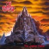
Clayman is definitely the most boring of the older albums cover art. I think it's fine but just really uninspired compared to TJR, Whoracle, Colony or Reroute.
ASOP is just not appealing to me at all. Doesn't give me any In Flames vibes. SOAPF is cool though. Artistically similar in some ways to Reroute.
ASOP is just not appealing to me at all. Doesn't give me any In Flames vibes. SOAPF is cool though. Artistically similar in some ways to Reroute.
Fuck, I wrote Clayman. Sorry, I meant Come Clarity (WTF was I thinking about?boring as fuck? lol contrarian alert
It's kind of ironic though, I used to like the Clayman album art, but I think that's because I used to be a Clayman fanboy. I got a shirt of it too, but I barely wear it anymore. It just looks like a really bad photoshop job.
Again, SOAPF is definitely one of the best. Not only is it artistic, but it has a message of obvious apocalyptic vibes in the imagery.
Cloudy skies, dark ambient, apocalyptic structures and or figures... all of them made and positioned in the same way and place, almost the same angle and perspective. Not really inspired or inspiring. At least, from R2R onwards they tried to be original when choosing the covers.Clayman is definitely the most boring of the older albums cover art. I think it's fine but just really uninspired compared to TJR, Whoracle, Colony or Reroute.
ASOP is just not appealing to me at all. Doesn't give me any In Flames vibes. SOAPF is cool though. Artistically similar in some ways to Reroute.


Boring.
Last edited:
Clay-Man
Anders pre-2003
- May 18, 2008
- 1,099
- 53
- 48
Cloudy skies, dark ambient, apocalyptic structures and or figures... all of them made and positioned in the same way and place, almost the same angle and perspective. Not really inspired or inspiring. At least, from R2R onwards they tried to be original when choosing the covers.
View attachment 15139 View attachment 15140 View attachment 15141
Boring.
it is kinda true
Similar threads
- Replies
- 4K
- Views
- 350K
- Replies
- 0
- Views
- 265
- Replies
- 0
- Views
- 182


